With Pinterest coming out of the woodwork and taking social media by storm in the recent months, it’s apparent that a lot of it’s popularity is down to it’s aesthetically pleasing layout. Pinterest’s “grid view” style for displaying pins is what the design world refers to as a Masonry Grid.
Masonry Grids are different from normal grids in that they do not have to be the same size as each other (like traditional grids created with CSS & HTML) and they slot in perfectly with each other despite their different lengths.
Traditional Grid

Masonry Grid

Creating a Masonry Grid
Let’s create a masonry grid made up of five boxes that is two columns wide.
HTML
This will create the physical elements of your grid. Images and text will both fit nicely in your individual grids and resize height wise to fit the width set in the next step.
<div class="category-grid”>
<div class="item”>
Content inside grid #1 sits here.
</div>
<div class="category-item”>
Content inside grid #2 sits here
</div>
<div class="category-item”>
Content inside grid #3 sits here
</div>
<div class="category-item”>
Content inside grid #4 sits here
</div>
</div>
CSS
This creates the masonry style for your grid.
.category-grid {
 -moz-column-count: 2; /* Amount of columns for your grid */
    -webkit-column-count: 2; /* Amount of columns for your grid */
    column-count: 2; /* Amount of columns for your grid */
    -moz-column-gap: 1em; /* Creates a small gap between your individual grid boxes */
    -webkit-column-gap: 1em; /* Creates a small gap between your individual grid boxes */
    column-gap: 1em; /* Creates a small gap between your individual grid boxes */

}

.item {
    background-color: #e4e4e4; /* Gives the individual grids a different background colour to create a neater look */
    display: inline-block;
    margin: 0 0 1em; /* Creates a bottom margin underneath the individual grids */
padding: 10px;
    width: 100%;
}
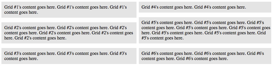
The outcome should look like this :
…and it really is as simple as that! In two simple steps you have created your very own masonry grid and not only that, a mobile responsive one!
 About Kate Jordan
Hi, thank you for this snippets! Tried to understand how to do masonry grid using css for several hours now.
Anyway, the CSS .item is intended for first box only, or is it a typo?
.item {
background-color: #e4e4e4; /* Gives the individual grids a different background colour to create a neater look */
display: inline-block;
margin: 0 0 1em; /* Creates a bottom margin underneath the individual grids */
padding: 10px;
width: 100%;
}