In this post we will create a simple breadcrumb navigation using CSS3. Earlier creation a breadcrumb navigation required the use of images but with advances in CSS it is now possible to achieve the same effect without using any images at all.
Here is what we will be creating in this tutorial.

The Concept
We will utilize a property called pseudo elements for this tutorial. Pseudo elements are a property of css3. Basically we will add two pseudo elements to our navigation block. Refer to the following picture for better understanding.

Looks pretty easy? It sure is. Lets start
Step 1 : Create a Simple Navigation Menu
Lets start by simple creating an ordered list of elements. Here is the HTML for the same
HTML
<head>
<link rel="stylesheet" type="text/css" href="style-nav.css">
</head>

<body>
<div id="my-breadcrumbs">
 <ul>
 <li><a href="#">Home</a></li>
 <li><a href="#">About</a></li>
 <li><a href="#">Product</a></li>
 <li><a href="#">Contact</a></li>

 </ul>
</div>
</body>
CSS
#my-breadcrumbs ul li {
 list-style:none;
}

#my-breadcrumbs {
margin-top: 250px;
margin-left: 300px;
}

#my-breadcrumbs ul li a {
 display: block;
 float: left;
 height: 50px;
 background: #4060A5;
 text-align: center;
 padding: 30px 40px 0 40px;
 position: relative;
 margin: 0 45px 0 0;
 font-family: "Open Sans", Helvetica, Arial, sans-serif;
 font-size: 20px;
 text-decoration: none;
 color: #fff;
}
This adds styling to our list element. Here is what we have till now

Step 2 : Add Pseudo Elements
As discussed before, we will add 2 pseudo elements, one after and one before the block. We have used a combination of border properties to achieve the desired effect.
CSS for After Pseudo Element
#my-breadcrumbs ul li a:after {
content: "";
    border-top: 40px solid transparent;
border-bottom: 40px solid transparent;
border-left: 40px solid #4060A5;
position: absolute; right: -40px; top: 0;
}
CSS for Before Pseudo Element
#my-breadcrumbs ul li a:before {
 content: "";
  position: absolute;

  margin-top: -30px;
  border-width: 40px 0 40px 40px;
  border-style: solid;
  border-color: #4060A5 #4060A5 #4060A5 transparent;
  left: -40px;
}
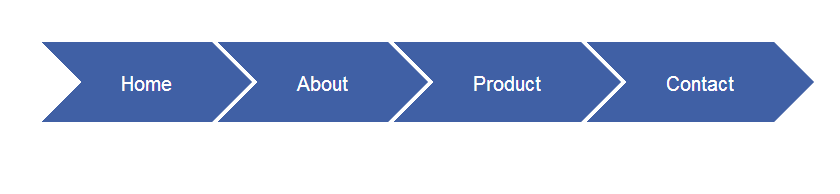
This how the navigation block looks now
Step 3 Final Touches
We will hide the before pseudo element and add rounded border effects to the firdt navigation block. We will utilize first-child property for the same. We will also add hover effects to our menus .
CSS
/* Hide the Before Pseudo Element */
#my-breadcrumbs ul li:first-child a:before {
    display: none; }

/* Add Border Radius */
#my-breadcrumbs ul li:first-child a{
    border-top-left-radius: 10px; border-bottom-left-radius: 10px;border-bottom-right-radius: 1px;
}

/* Hover Effects */
#my-breadcrumbs ul li a:hover::before {
  border-color: #5172B8 #5172B8 #5172B8 transparent;
}
/* Hover Effects */
#my-breadcrumbs ul li a:hover::after {
      border-top: 40px solid transparent;
border-bottom: 40px solid transparent;
border-left: 40px solid #5172B8;
}
With this our navigation element is complete . This is how it will look now. I really hope you enjoyed the tutorial. We will be back with more.

 About Ankit
Thanks for sharing this CSS 3 Menu. I would be help for anyone who is starting on CSS3. Hope I had these kinds of examples while I was learning CSS. Thanks for sharing.
You are welcome
I tried it and works well. Cheers
Hey Priyanshu.. Thanks!!
Works as a charm, really nice one.
Can’t figure why I can’t change width and background color at certain ‘s with an extra classname or :nth-child(). It’s like some change all or none, is there any way to work around that?
What changes should I make in the CSS to make it Right to left (RTL).
Really great job. It worked perfectly.