In this tutorial we will learn how to create a Stitched Ribbon banner using CSS3 techniques. We will achieve the banner effect without using any images. Before CSS3 the only way to create a banner effect was to use images.
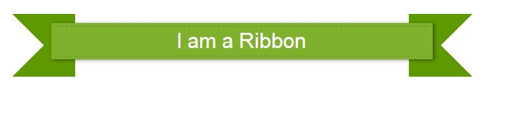
This is what we will be creating

The Concept
Just like in the earlier tutorial, we will be utilizing the pseudo elements to achieve the ribbon effect. We will also utilize Box shadow technique to create the stitched effect.
Lets start
Step 1 HTML Markup
Lets start by creating a simple element. The HTML for it is pretty straight forward.
HTML
<head>
<link rel="stylesheet" type="text/css" href="style.css">
</head>
<body>
<div class="my-ribbon">
 I am a Ribbon
</div>
</body>
Step 2 Apply CSS
We will now add some styling to our div element. This CSS will also create a stitched effect. We will utilize a combination of Box Shadows to achieve the stitched effect. Refer to this post for in depth explanation
CSS for Stitched Effect
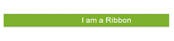
 .my-ribbon {
 font-size: 30px !important;

font-family: "Open Sans", Helvetica, Arial, sans-serif;
 width: 50%;
 position: relative;
 background: #7EB12C;
 color: #fff;
 text-align: center;
 padding: 0.1em 0.2em;
 margin: 150px 350px ;

 /* The following CSS rules will give stitched look to our element */

 -moz-box-shadow: 0 0 0 4px #7EB12C, 2px 1px 4px 4px rgba(10,10,0,.5);
 -webkit-box-shadow: 0 0 0 4px #7EB12C, 2px 1px 4px 4px rgba(10,10,0,.5);
 box-shadow: 0 0 0 4px #7EB12C, 2px 1px 6px 4px rgba(10,10,0,.5);
 border-top: 1px dashed rgba(0, 0, 0, 0.2);
    border-bottom: 1px dashed rgba(0, 0, 0, 0.2);
}
This is what we have now
Step 3 Add Pseudo Elements
We will now add 2 Pseudo Elements to create the Ribbon Effect. The Pseudo Elements have negative z-index and a different background color. The negative z-index makes sure that banner appears on top of the ribbon.
CSS for Pseudo Elements
.my-ribbon:before, .my-ribbon:after {
 content: "";
 position: absolute;
 display: block;
 bottom: -1em;
 border: 1.5em solid #5F9900;
 z-index: -1;
  }

.my-ribbon:before {
 left: -2em;
 border-right-width: 1.5em;
 border-left-color: transparent;
}
.my-ribbon:after {
 right: -2em;
 border-left-width: 1.5em;
 border-right-color: transparent;
}
With this our Ribbon is now complete. Here is the final result
I hope you liked the tutorial. We will be back with more in future.
 About Ankit
[…] This is how you create a Stitched Ribbon with CSS3 […]